# CSS 简介及实用技巧
# CSS 设计理念
CSS2.1 作为 CSS2 和 CSS1 的后序版本,基于一下一组设计理念:
- 向前和向后兼容。CSS2.1 的用户代理能够理解 CSS1 的样式表。 CSS1 的用户代理能够读取 CSS2.1 的样式表,并且丢弃他们不能理解的部分。同时,对于不支持 CSS 的用户代理可以显示样式增强的文档。当然通过 CSS 增强的样式将不被渲染,但所有的内容可以被表现。
- 作为结构化文档的补充。样式表补充结构化文档(例如,HTML 和 XML 应用程序),为标记文本提供样式信息。样式表应该非常容易修改,并对标记的影像甚微或没有。
- 供应商,平台和设备无关。样式表使文档保持供应商,平台和设备无关。样式表本身也是供应商和平台无关的,但 CSS2.1 允许你为一组设备指定一个样式表(例如,打印机)。
- 可维护性。通过在文档中指向样式表,网站管理员能简化站点的维护和保持整个站点的一致外观和感觉。例如,如果组织的背景色发生改变,仅需更改一个文件。
- 简单。CSS 是一门简单的样式语言,是对人类读写友好的。CSS 的属性保持最大程度上的相互独立,一般实现一个效果只有一种方法。
- 网络性能。CSS 为内容的呈现方式提供了紧凑的编码。图片或音频文件常被作者用来实现某种特定的渲染效果,样式表和其比起来体积要小的多。同时,减少网络链接的次数,进一步提高网络性能。
- 灵活性。有几种方法可以将 CSS 应用到内容。关键特征是不同位置的样式信息能够层叠,包括默认(用户代理)样式表,用户样式表,链接样式表,内嵌样式,和元素属性中的样式信息。渴求的某些渲染效果和设备无关相冲突,但 CSS2.1
- 丰富的。为作者提供一组丰富的渲染效果,增加网站作为表达媒介的丰富性。设计师们已经对桌面版和幻灯片应用中的常见功能渴望许久。但 CSS2.1 为满足设计师的要求,向前迈了一大步。
- 可选的语言绑定。规范中描述的一组 CSS 属性使视觉和听觉格式化模型表现一致。其格式化模型可以通过 CSS 语言访问,但也可以绑定到其他语言。例如,在 JavaScript 程序中可以动态改变某个元素的‘color’属性值。
- 可访问性。一些 CSS 功能将使网络更方便残障用户:
- 控制字体外观属性允许作者消除不可访问的文图图片。
- 位置属性允许作者消除强制布局的标记技巧(例如,不可见图片)。
- !improtan 规则的意义在于有特别演示要求的用户可以覆盖作者的样式表。
- 所有属性的‘inherit’值用来提升层叠的通用性,和更容易生成一致的风格。
- 改进媒体支持,包括媒体分组和 braille,embossed,和 tty 媒体类型,允许用户或作者为这些设备定制页面。
# CSS 选择器

# 圣杯布局
CSS 实现水平垂直居中的 1010 种方式 (opens new window)
 <div class="contant">
     <!--        //类似京东商城banner,中间需要提前加载-->
     <div class="middle">中间</div>
     <div class="left">
         <p>你好</p>
         <p>您好</p>
     </div>
     <div class="right">右边</div>
 </div>
  <style>
        *{
            margin: 0;
            padding: 0;
        }
        div{
            text-align: center;
        }
        .contant{
            padding: 0 200px 0 150px;
            overflow: hidden;
        }
        .middle{
            float: left;
            background: pink;
            width: 100%;
        }
        .left{
            float: left;
            width: 150px;
            margin-left: -100%;
            background: yellow;
            position: relative;
            left: -150px;
        }
        .right{
            float: left;
            width: 200px;
            margin-left: -200px;
            background: blue;
            position: relative;
            left: 200px;
        }
        .left ,.middle ,.right{
            padding-bottom: 9999px;
            margin-bottom: -9999px;
        }
    </style>
2
3
4
5
6
7
8
9
10
11
12
13
14
15
16
17
18
19
20
21
22
23
24
25
26
27
28
29
30
31
32
33
34
35
36
37
38
39
40
41
42
43
44
45
46
47
# 双飞翼布局
margin 不改变盒子布局
<div class="contant">
    <div class="middle">
        <div class="inner">
            中间
        </div>
    </div>
    <div class="left">
        左边
    </div>
    <div class="right">
        右边
    </div>
</div>
    <style>
        *{
            margin:0;
            padding: 0;
        }
        .contant{
            overflow: hidden;
        }
        .middle{
            width: 100%;
            float: left;
            background: yellow;
        }
        .inner{
            margin-left: 200px;
            margin-right: 150px;
        }
        .left{
            float: left;
            margin-left: -100%;
            width: 200px;
            background: red;
        }
        .right{
            width: 150px;
            background: blue;
            float: left;
            margin-left: -150px;
        }
        .left,.middle,.right{
            padding-bottom:9999px;
            margin-bottom:-9999px;
        }
    </style>
2
3
4
5
6
7
8
9
10
11
12
13
14
15
16
17
18
19
20
21
22
23
24
25
26
27
28
29
30
31
32
33
34
35
36
37
38
39
40
41
42
43
44
45
46
47
# flex 布局
在 flex 之前,传统布局有流式布局(就是默认的方式),绝对定位布局,弹性布局(em),和浮动布局,其中浮动布局并不是为布局而设计的,使用起来略显繁琐
2009 年,对前端来说是不平凡的一年,html5 定稿,es5.1 发布,flex 应运而生,天生响应式,生而为布局,使用及其简单
# 容器的属性
容器属性包括:
- display
- flex-direction
- flex-wrap
- flex-flow
- justify-content
- align-items
- align-content
display
| 标准版 | 09 版 |
|---|---|
| display: flex | display: box |
| display: inline-flex | display: inline-box |
flex-direction
| 标准版 | 09 版 |
|---|---|
| flex-direction: row | box-orient: horizontal; box-direction: normal |
| flex-direction: row-reverse | box-orient: horizontal; box-direction: reverse |
| flex-direction: column | box-orient: vertical; box-direction: normal |
| flex-direction: column-reverse | box-orient: vertical; box-direction: reverse |
flex-wrap
| 标准版 | 09 版 |
|---|---|
| flex-wrap: nowrap | box-lines: single |
| flex-wrap: wrap | box-lines: multiple |
| flex-wrap: wrap-reverse | 无 |
flex-flow 是 flex-direction 和 flex-wrap 两个属性的简写,09 版无对应属性,09 版可以分开写两条属性
justify-content
| 标准版 | 09 版 |
|---|---|
| justify-content: flex-start | box-pack: start |
| justify-content: flex-end | box-pack: end |
| justify-content: center | box-pack: center |
| justify-content: space-between | box-pack: justify |
| justify-content: space-around | 无 |
align-items
| 标准版 | 09 版 |
|---|---|
| align-items: flex-start | box-align: start |
| align-items: flex-end | box-align: end |
| align-items: center | box-align: center |
| align-items: baseline | box-align: baseline |
| align-items: stretch | box-align: stretch |
align-content,09 版无对应属性
# 项目属性
项目属性包括:
- order
- flex-grow
- flex-shrink
- flex-basis
- flex
- align-self
order
| 标准版 | 09 版 |
|---|---|
| order: number | box-ordinal-group: number |
flex-grow,09 版无对应属性
flex-shrink,09 版无对应属性
flex-basis,09 版无对应属性
flex,标准版的 flex 是一个复合属性,09 版的 box-flex 仅支持配置数字
| 标准版 | 09 版 |
|---|---|
| flex: flex-grow flex-shrink flex-basis | box-flex: number |
align-self,09 版无对应属性
# 弹性盒模型与 reset 的选择
*的杀伤力太大
Reset.css 重置 Normalize.css 修复 Neat.css 融合了 Reset.css 与 Normalize.css
html{box-sizing: border-box;} ,:before,X:after{box-sizing: inherit;} inherit 继承
# 相关资料
# BFC
Box: CSS 布局的基本单位
Box 是 CSS 布局的对象和基本单位, 直观点来说,就是一个页面是由很多个 Box 组成的。元素的类型和 display 属性,决定了这个 Box 的类型。 不同类型的 Box, 会参与不同的 Formatting Context(一个决定如何渲染文档的容器),因此 Box 内的元素会以不同的方式渲染。让我们看看有哪些盒子:
block-level box:display 属性为 block, list-item, table 的元素,会生成 block-level box。并且参与 block fomatting context;
inline-level box:display 属性为 inline, inline-block, inline-table 的元素,会生成 inline-level box。并且参与 inline formatting context;
Formatting context 是 W3C CSS2.1 规范中的一个概念。它是页面中的一块渲染区域,并且有一套渲染规则,它决定了其子元素将如何定位,以及和其他元素的关系和相互作用。最常见的 Formatting context 有 Block fomatting context (简称 BFC)和 Inline formatting context (简称 IFC)
# 哪些元素会生成 BFC
根元素

float属性不为none

position为absolute或fixed

display为inline-block, table-cell, table-caption, flex, inline-flex

overflow不为visible
2
3
4
5
6
7
8
9
根据 BFC 布局规则:每个元素的 margin box 的左边,与包含块 border box 的左边相接触(对于从左往右的格式化)。即使存在浮动也是如此。BFC 的区域不会与 float box 重叠
根据 BFC 布局规则:每个元素的 margin box 的左边,与包含块 border box 的左边相接触(对于从左往右的格式化)。即使存在浮动也是如此。BFC 的区域不会与 float box 重叠
<style>
    body {
        width: 300px;
        position: relative;
    }

    .aside {
        width: 100px;
        height: 150px;
        float: left;
        background: #f66;
    }

    .main {
        height: 200px;
        background: #fcc;
    }
</style>

<body>
    <div class="aside">1111</div>
    <div class="main"></div>
</body>
2
3
4
5
6
7
8
9
10
11
12
13
14
15
16
17
18
19
20
21
22
23
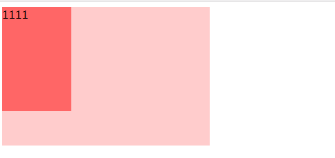
自适应两栏布局
.main {overflow: hidden;}

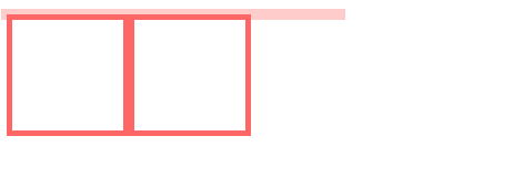
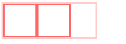
清除内部浮动,生成 BFC 元素,计算 BFC 高度时,浮动元素也会参与计算
        .par {
            border: 5px solid #fcc;
            width: 300px;
        }

        .child {
             border: 5px solid #f66;
            width: 100px;
            height: 100px;
            float: left;
        }
    </style>

<body>
<div class="par">
    <div class="child"></div>
    <div class="child"></div>
 </div>
2
3
4
5
6
7
8
9
10
11
12
13
14
15
16
17
18
.par{
              overflow: hidden;
}
2
3
Box 垂直方向的距离由 margin 决定。属于同一个 BFC 的两个相邻 box 的 margin 会发生重叠·。我们可以在 p 外面包裹一层容器,并触发该容器生成 BFC,那 p 标签在不同的 BFC,margin 就不会发生重叠了。
<style>
    p {
         color: #f55;
         background: #fcc;
         width: 200px;
        line-height: 100px;
         text-align: center;
         margin: 100px;
    }

  </style>

<body>
<p>Haha</p>
<p>Hehe</p>
2
3
4
5
6
7
8
9
10
11
12
13
14
15
##CSS 绘制特殊图形
等腰三角形
 /* 相邻的border组合成矩形,各负责一个三角形 */
 div.dengyaosanjiaoxing {
            width: 0;
            height: 0;
            background-color: transparent;
            border: 30px solid;
            border-left-color: transparent;
            border-bottom-color: yellowgreen;
            border-top-color: transparent;
            border-right-color: transparent;
        }
2
3
4
5
6
7
8
9
10
11
直角三角形
div.zhijiaosanjiaoxing {
            width: 0;
            height: 0;
            background-color: transparent;
            border: 30px solid;
            border-left: 0;
            border-bottom: 0;
            border-right-color: yellow;
            border-top-color: transparent;
        }
2
3
4
5
6
7
8
9
10
绘制五角星
实现三个三角形,可以是通过三个标签;但是这里用的是 CSS 的伪元素选择器(::before, ::after)来实现的并且对于三个选择器通过 position 定位就能组合成一个完整的五角星了
        .star-five {
            width: 0;
            height: 0;
            position: relative;
            border-bottom: 70px solid blue;
            border-left: 100px solid transparent;
            border-right: 100px solid transparent;
            transform: rotate(35deg);
            -moz-transform: rotate(35deg);
            /* Firefox */
            -o-transform: rotate(35deg);
            /* Opera */
            -webkit-transform: rotate(35deg);
            /* Safari and Chrome */
            -ms-transform: rotate(35deg);
            /* IE 9 */
            margin-top: 80px;
        }

        .star-five::before {
            content: '';
            width: 0;
            height: 0;
            display: block;
            border-bottom: 70px solid red;
            border-left: 100px solid transparent;
            border-right: 100px solid transparent;
            position: absolute;
            top: 0;
            left: -94px;
            transform: rotate(75deg);
            -moz-transform: rotate(75deg);
            /* Firefox */
            -o-transform: rotate(75deg);
            /* Opera */
            -webkit-transform: rotate(75deg);
            /* Safari and Chrome */
            -ms-transform: rotate(75deg);
            /* IE 9 */
        }

        .star-five::after {
            content: '';
            width: 0;
            height: 0;
            color: blue;
            border-bottom: 70px solid green;
            border-left: 100px solid transparent;
            border-right: 100px solid transparent;
            transform: rotate(-70deg);
            -moz-transform: rotate(-70deg);
            /* Firefox */
            -o-transform: rotate(-70deg);
            /* Opera */
            -webkit-transform: rotate(-70deg);
            /* Safari and Chrome */
            -ms-transform: rotate(-70deg);
            /* IE 9 */
            position: absolute;
            left: -100px;
            top: 0;
        }

        /* 上半圆 */

        .semi-circle {
            margin-top: 100px;
            width: 100px;
            height: 50px;
            border-radius: 50px 50px 0 0;
            background: orange;
        }
        /* 下半圆 */

        .semi-circle1 {
            margin-top: 100px;
            width: 100px;
            height: 50px;
            border-radius: 0 0 50px 50px;
            background: orange;
        }
2
3
4
5
6
7
8
9
10
11
12
13
14
15
16
17
18
19
20
21
22
23
24
25
26
27
28
29
30
31
32
33
34
35
36
37
38
39
40
41
42
43
44
45
46
47
48
49
50
51
52
53
54
55
56
57
58
59
60
61
62
63
64
65
66
67
68
69
70
71
72
73
74
75
76
77
78
79
80
81
82
css 绘制腾讯公司企鹅 logo (opens new window)