# CSS3 构造 3D 世界
# 3d 优秀网站
pc 端 720yun.com (opens new window)
# HTML5 陀螺仪

1.deviceorientation :设备的物理方向信息,表示为一系列本地坐标系的旋角
2.devicemotion:提供设备的加速信息
3.compassneedscalibration:用于通知 Web 站点使用罗盘信息校准上述事件
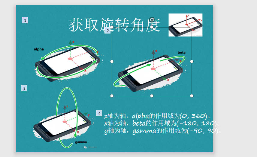
//获取旋转角度
window.addEventListener('deviceorientation',function(e){
console.log(e.alpha)
console.log(e.beta)
console.log(e.gamma)
},true)
1
2
3
4
5
6
2
3
4
5
6
获取罗盘校准
window.addEventListener('compassneedscalibration',function(e){
//告诉需要校准,是alpha,beta,gamma精准
preventDefault();
},true)
1
2
3
4
5
2
3
4
5
获取重力加速度
window.addEventListener(
  "devicemotion",
  function (event) {
    // 处理event.acceleration
    //	x(y,z):设备在x(y,z)方向上的移动加速度值
    //event.accelerationIncludingGravity
    //考虑了重力加速度后设备在x(y,z)
    // event.rotationRate
    //alpha,beta,gamma:设备绕x,y,z轴旋转的角度
  },
  true
);
1
2
3
4
5
6
7
8
9
10
11
12
2
3
4
5
6
7
8
9
10
11
12
微信摇一摇
if (window.DeviceMotionEvent) {
    window.addEventListener(´devicemotion´, deviceMotionHandler, false);
} else {
    alert(´抱歉,你的手机配置实在有些过不去,考虑换个新的再来试试吧´);
}

HTML5仿微信手机摇一摇代码_摇一摇抽奖JS代码实现
2016-10-08 13:10:12  By: dwtedx
dwtedx HTML5开发 0 7325 17


分享一个HTML5开发的手机端的摇一摇、整个Demo是仿微信的摇一摇功能的、当打开网页之后摇晃手机就会播放熟悉的声音、也就是会播放微信摇一摇的声音、2秒之后就会出来相应的广告信息、也就是摇动手机的结果、也是带有声音的哦、下面是整个Demo的gif效果

html摇一摇代码


整个Demo主要是使用的JS代码来控制的、并包涵了一些html代码和两个mp3文件、然后就是js代码了、css样式直接写到html文件里面的、大家可以根据自己的需求更改


Html代码

<div id="hand" class="hand"><img src="images/hand.png"></div>
    <div id="loading" class="loading">
        <span class="icon"></span>
        <span class="txt">正在努力的加载结果,请稍候~</span>
    </div>
    <div id="result" class="result">
        <div class="con">
            <div class="imgLeft">
                <img src="images/logo_com01.jpg">
            </div>
            <div class="contRight">
            <p class="mainTitle">DD博客</p>
            <p class="subTitle">你想要的代码都能有</p>
        </div>
    </div>
</div>


js监听摇晃动作

if (window.DeviceMotionEvent) {
    window.addEventListener(´devicemotion´, deviceMotionHandler, false);
} else {
    alert(´抱歉,你的手机配置实在有些过不去,考虑换个新的再来试试吧´);
}

deviceMotionHandler处理

function deviceMotionHandler(eventData) {

    var acceleration = eventData.accelerationIncludingGravity;
    var curTime = new Date().getTime();


    if ((curTime - last_update) > 100) {
        var diffTime = curTime - last_update;
        last_update = curTime;
        x = acceleration.x;
        y = acceleration.y;
        z = acceleration.z;
        var speed = Math.abs(x   y   z - last_x - last_y - last_z) / diffTime * 10000;
        var status = document.getElementById("status");

        if (speed > SHAKE_THRESHOLD) {


            //触发代码
            times  ;

        }
        last_x = x;
        last_y = y;
        last_z = z;
    }
}
1
2
3
4
5
6
7
8
9
10
11
12
13
14
15
16
17
18
19
20
21
22
23
24
25
26
27
28
29
30
31
32
33
34
35
36
37
38
39
40
41
42
43
44
45
46
47
48
49
50
51
52
53
54
55
56
57
58
59
60
61
62
63
64
65
66
67
68
69
70
71
72
73
74
75
76
2
3
4
5
6
7
8
9
10
11
12
13
14
15
16
17
18
19
20
21
22
23
24
25
26
27
28
29
30
31
32
33
34
35
36
37
38
39
40
41
42
43
44
45
46
47
48
49
50
51
52
53
54
55
56
57
58
59
60
61
62
63
64
65
66
67
68
69
70
71
72
73
74
75
76
# CSS 3D 模型
# 3D 魔方效果
CSS部分
  #box{
            animation-name: rotateAniamation;
            -webkit-animation-timing-function: ease-in-out;
            -webkit-animation-iteration-count: infinite;
            -webkit-animation-duration: 3s;
            width: 100px;
            height: 100px;
            transform-style: preserve-3d;
            -webkit-transform-style: preserve-3d;
            /*perspective: 150px;*/
        }
       #box div.son{
           position: absolute;
           width: 100px;
           height: 100px;
           text-align: center;
           opacity: 0.7;
       }
        .before{
            transform: translateZ(50px);
            background: green;
        }
        .after{
            transform: translateZ(-50px);
            background: yellow;
        }
        .top{
        transform: rotateX(-90deg) translateZ(-50px);

            background: blue;
        }
        .bottom{
            transform: rotateX(-90deg) translateZ(50px);
            background: #00E676;
        }
        .left{
            transform: rotateY(90deg) translateZ(-50px);
            background: #0b2e13;
        }
        .right{
            transform: rotateY(90deg) translateZ(50px);
            background: #4E9DFF;
        }
        @keyframes rotateAniamation {
            from,to{}
            10%{transform: rotateY(45deg)}
            50%{transform: rotateZ(150deg) rotateY(90deg)}
            100%{transform: rotateX(45deg)}
        }
HTML部分
<div style="margin: 80px auto 0 auto;height: 100px;width: 100px;">
    <div id="box">
        <div class="son before">before</div>
        <div class="son after">after</div>
        <div class="son top">top</div>
        <div class="son bottom">bottom</div>
        <div class="son left">left</div>
        <div class="son right">right</div>
    </div>
</div>


别人的3D魔方
<style type="text/css">

            #box div
            {
                position: absolute;
                height: 160px;
                width: 160px;
                border: 3px solid #000;
                background: rgba(255,200,100,0.8);
                text-align: center;
                font-size: 130px;
            }

            #box
            {
                -webkit-animation-name: animation;
                -webkit-animation-timing-function: ease-in-out;
                -webkit-animation-iteration-count: infinite;
                -webkit-animation-duration: 3s;
                margin:80px;
                transform-style: preserve-3d;
                -webkit-transform-style: preserve-3d;
                transform-origin:80px 80px 0 ;
                -webkit-transform-origin: 80px 80px 0;

            }

            #box .one
            {
                -webkit-transform: translateZ(80px);
            }
            #box .two
            {
                -webkit-transform: rotateX(-90deg) translateZ(80px);
            }
            #box .three
            {
                -webkit-transform: rotateY(90deg) rotateX(90deg) translateZ(80px);
            }
            #box .four
            {
                -webkit-transform: rotateY(180deg) rotateZ(90deg) translateZ(80px);
            }
            #box .five
            {
                -webkit-transform: rotateY(-90deg) rotateZ(90deg) translateZ(80px);
            }
            #box .six
            {
                -webkit-transform: rotateY(90deg) translateZ(80px);
            }

            @-webkit-keyframes animation
            {
                from,to{}
                16% { -webkit-transform: rotateY(-90deg);}
                33% { -webkit-transform: rotateY(-90deg) rotateZ(135deg);}
                50% { -webkit-transform: rotateY(225deg) rotateZ(135deg);}
                66% { -webkit-transform: rotateY(135deg) rotateX(135deg);}
                83% { -webkit-transform: rotateX(135deg);}
            }
        </style>

                <div id="view" style="width:160px; height:160px; margin:80px auto 0 auto;">
            <div id="box">
                <div class="one">A</div>
                <div class="two">B</div>
                <div class="three">C</div>
                <div class="four">D</div>
                <div class="five">E</div>
                <div class="six">F</div>
            </div>
        </div>
1
2
3
4
5
6
7
8
9
10
11
12
13
14
15
16
17
18
19
20
21
22
23
24
25
26
27
28
29
30
31
32
33
34
35
36
37
38
39
40
41
42
43
44
45
46
47
48
49
50
51
52
53
54
55
56
57
58
59
60
61
62
63
64
65
66
67
68
69
70
71
72
73
74
75
76
77
78
79
80
81
82
83
84
85
86
87
88
89
90
91
92
93
94
95
96
97
98
99
100
101
102
103
104
105
106
107
108
109
110
111
112
113
114
115
116
117
118
119
120
121
122
123
124
125
126
127
128
129
130
131
132
133
134
135
136
137
138
139
140
总结:
了解 transform 中的一些基本概念,比如:
translate (opens new window) 定义 2D 转换
translateZ (opens new window) 定义 3D 转换
perspective (opens new window) 为 3D 转换元素定义透视视图。
transform-style: preserve-3d; (opens new window) 指定子元素定位在三维空间内。另外,该属性是非继承的。